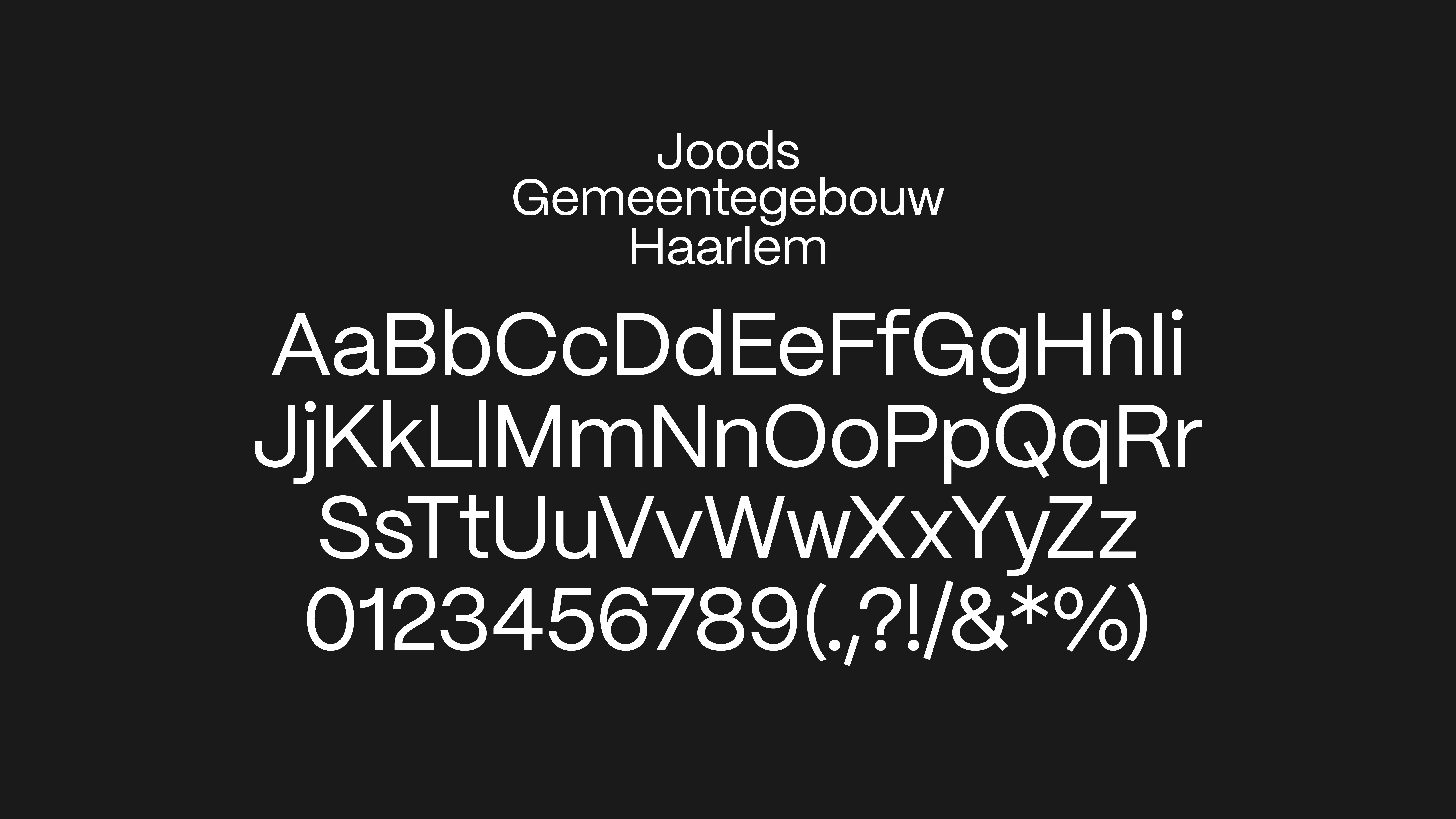
Joods Gemeentegebouw Haarlem Stichting JGH
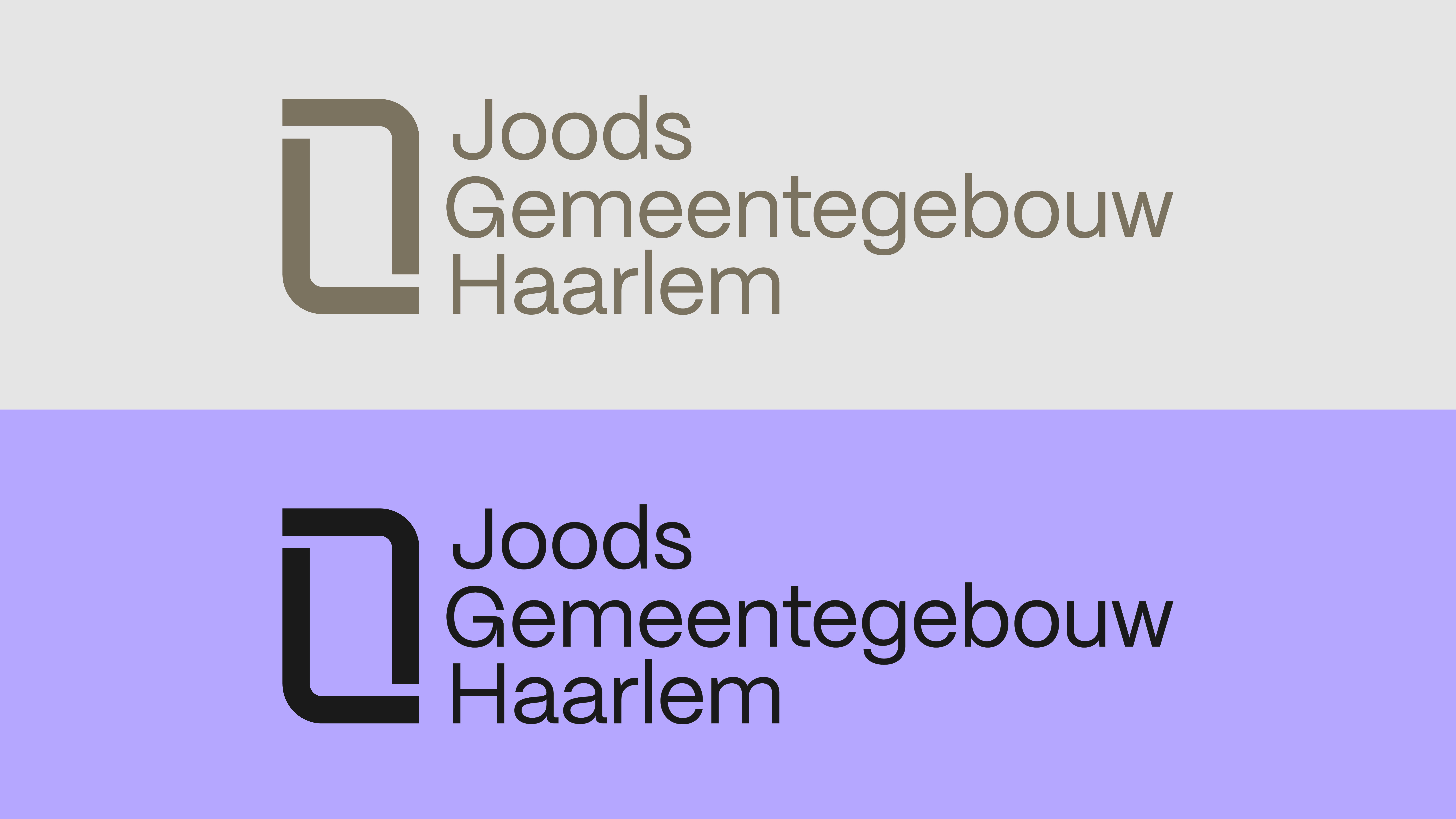
The rounded shapes of the Hebrew script are the main inspiration for the visual identity of Joods Gemeentegebouw Haarlem.
Animations by Daan Alberts
The monumental building on the Lange Wijngaardstraat was once the heart of the Jewish community in Haarlem. Stichting Joods Gemeentegebouw Haarlem is renovating and transforming the building into a museum and educational center, and reconnecting it with its history. Permanent and temporary exhibitions will soon tell the story of 300 years of Jewish life in Haarlem, and the period of isolation and persecution during World War II.
Mayra & Sam developed the visual identity and logo for this new cultural institution. The rounded shapes of the Hebrew script are the main inspiration for the recognizable icon. The corporate identity aims to encompass and reframe these stories with the dynamic lines of the logo, which will be reflected in all of the institution's visual communications.


Client Stichting Joods Gemeentegebouw Haarlem
Year 2023
Graphic Design Studio Mayra & Sam
Animations Daan Alberts
Year 2023
Graphic Design Studio Mayra & Sam
Animations Daan Alberts