POP MODELS Museum MORE
Comic strips, vibrant colors, plastic curtains: Pop Art asks for a a bold and flashy exhibition design.
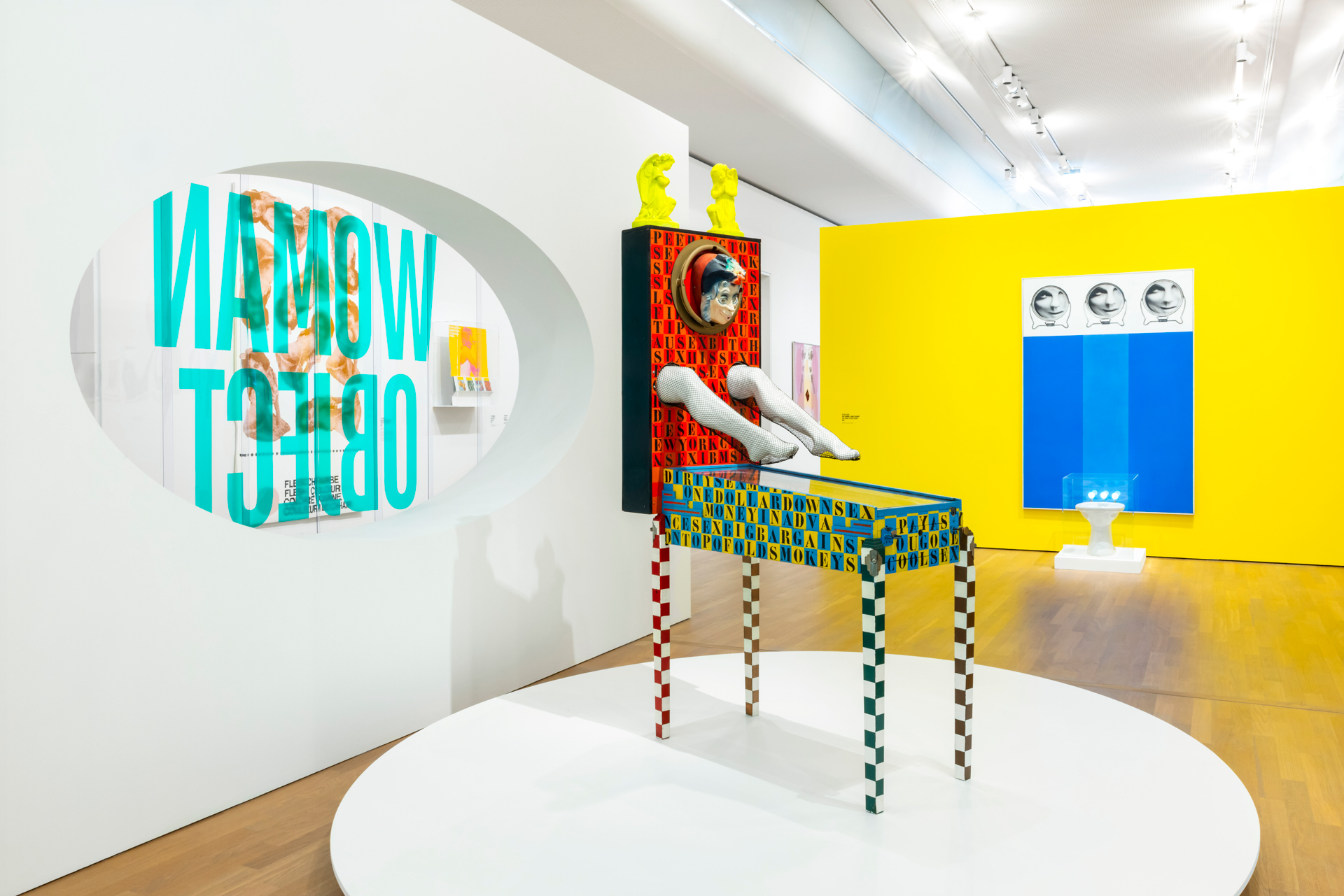
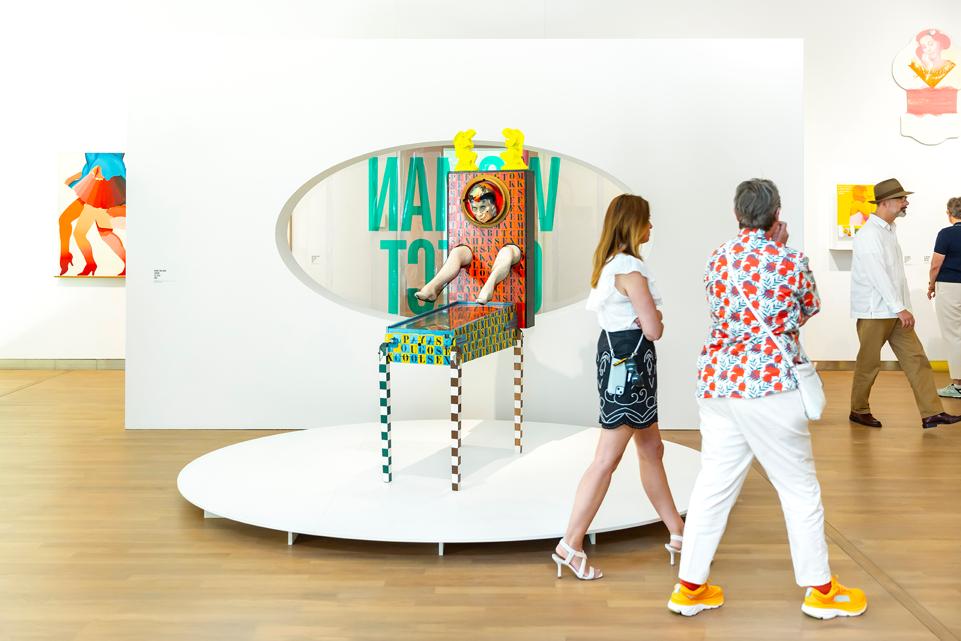
Advertisements, comic strips, bold colours – and women. These are defining elements of Pop Art in the 1960s and 1970s. The role of women in Pop Art was twofold. They embodied a stereotypical ideal, while also emerging as symbols of liberation. Women were both supermodels and role models.
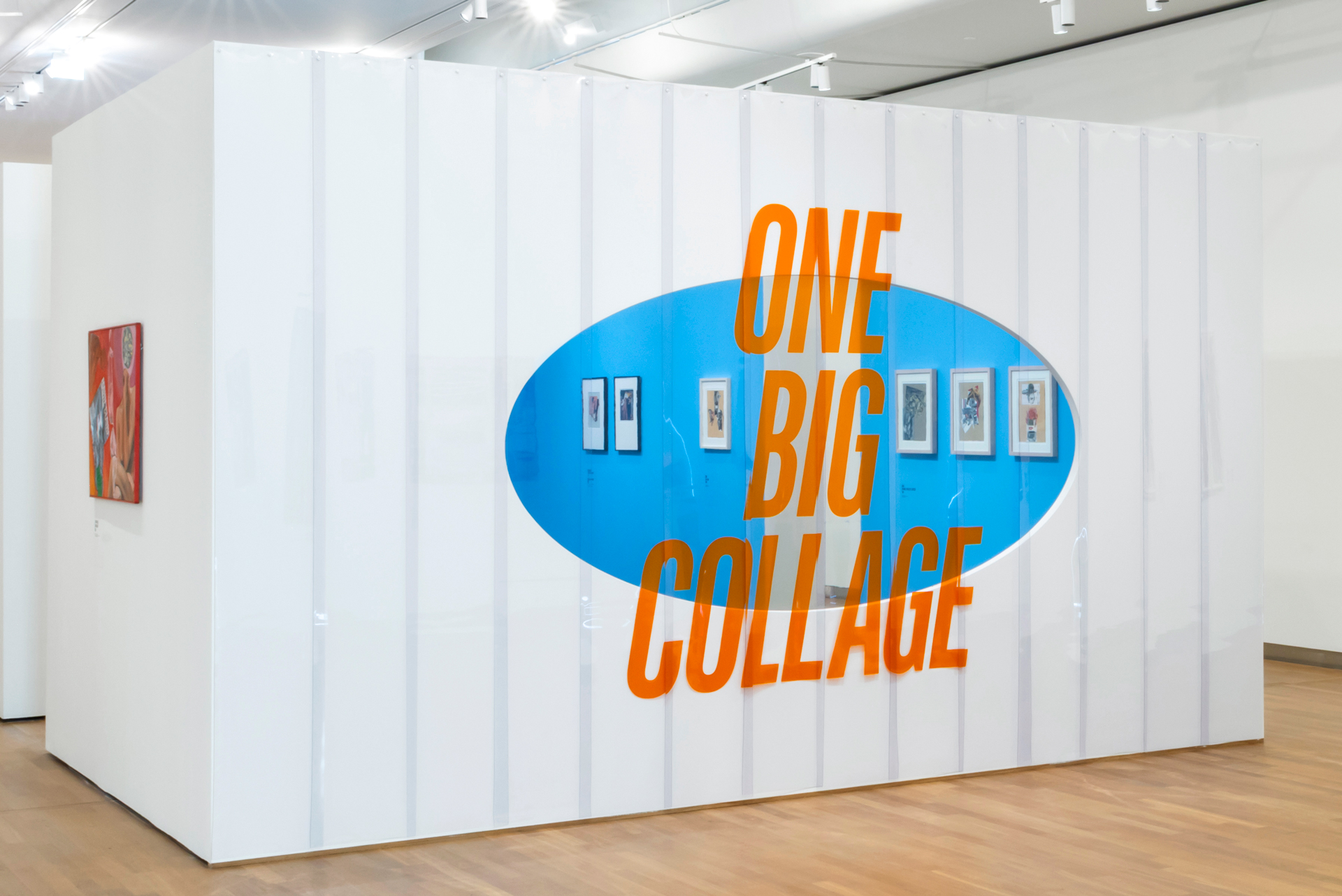
In POP MODELS, Museum MORE becomes the first museum to put women in Pop Art at the centre stage. As both muses and makers. Together with spatial designer Lies Willers, Mayra & Sam are responsible for the graphic design of the exhibition.
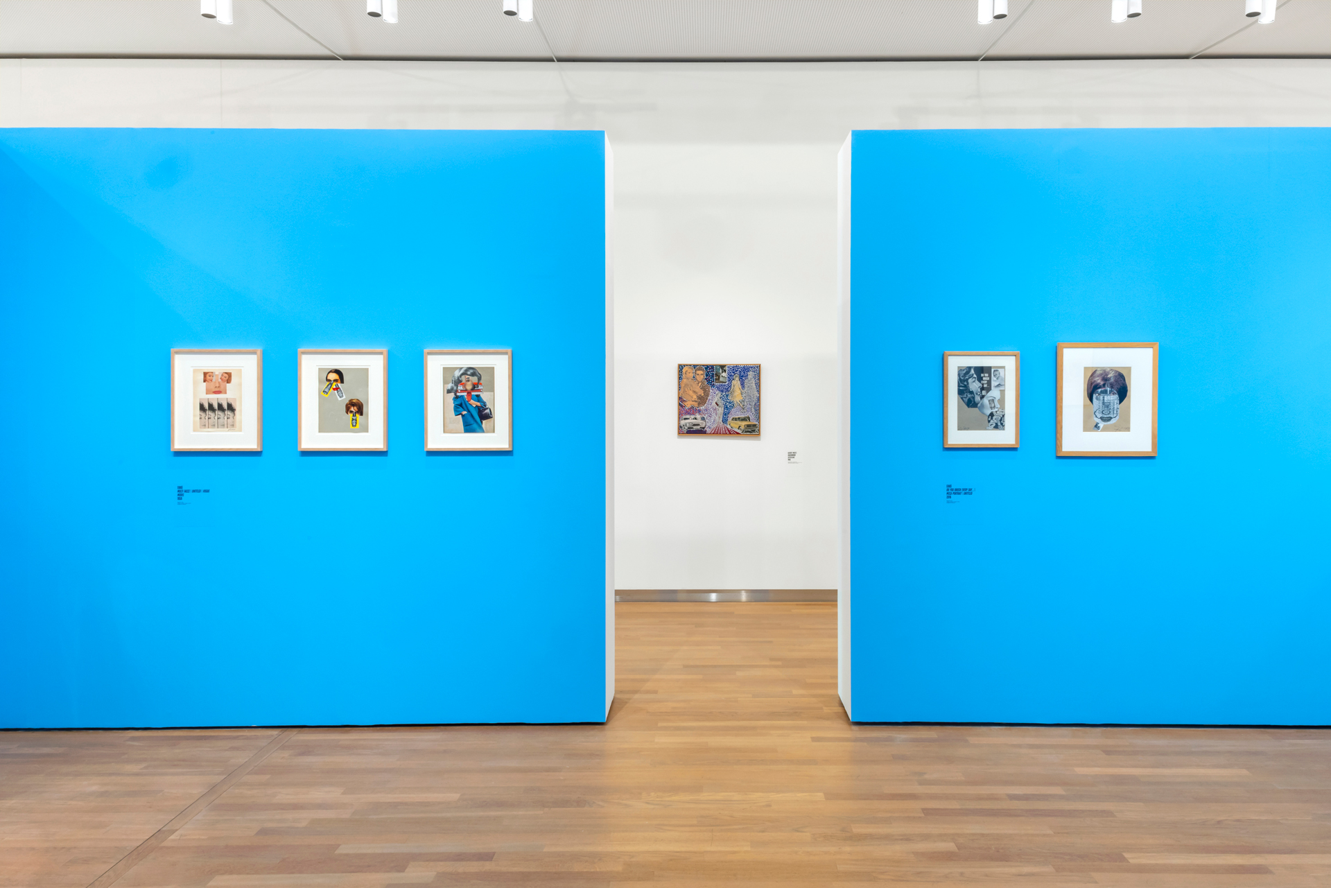
We incorporated these iconic Pop Art elements into a bold and flashy exhibition design. Typography based on comic strips; bright and vibrant colors on the walls; plastic curtains representing consumer society. Together with the extensive selection of Pop Art paintings, collages, and objects, it allows the visitor to dive deep into this colorful and bold period in art history.
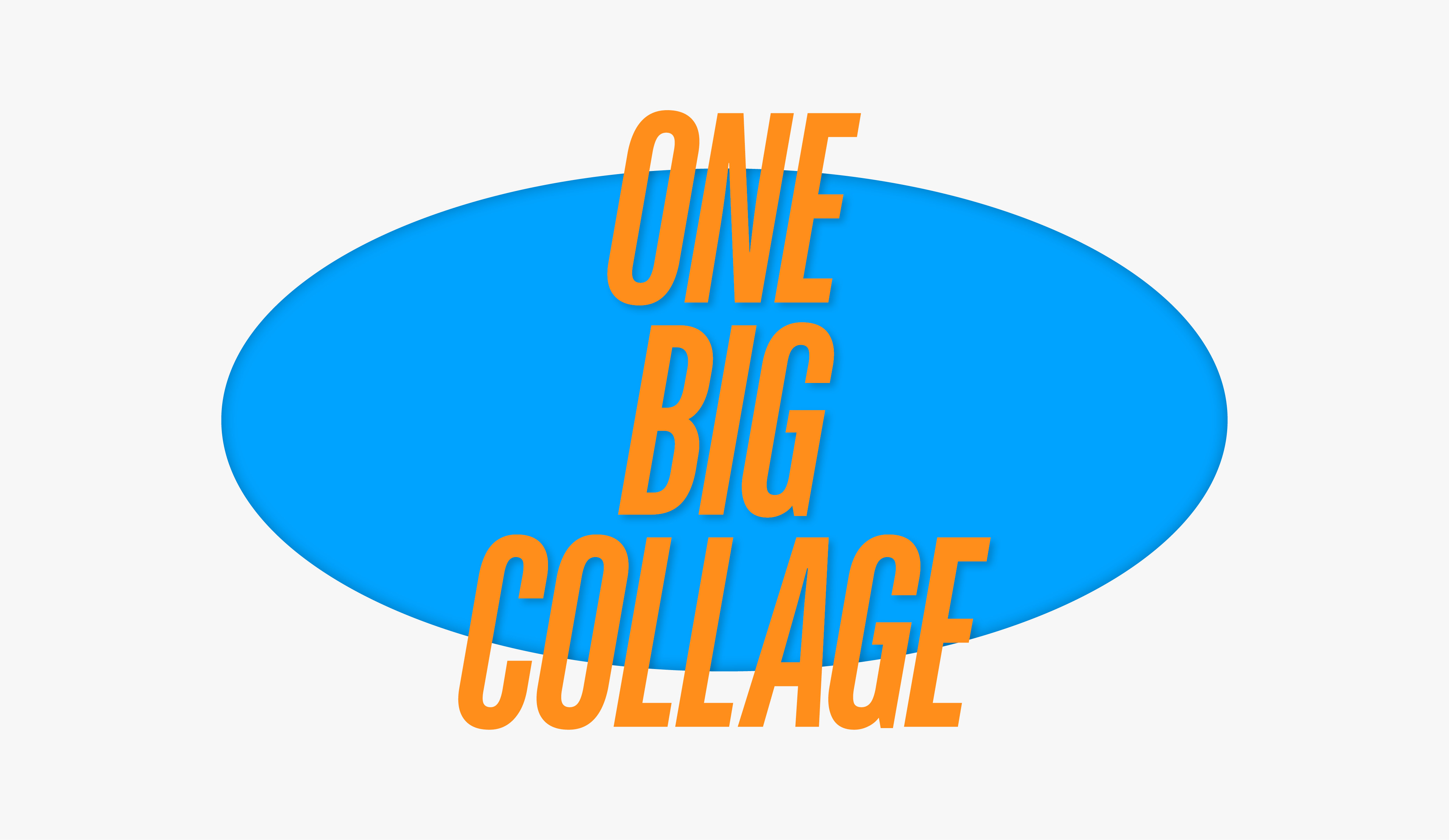
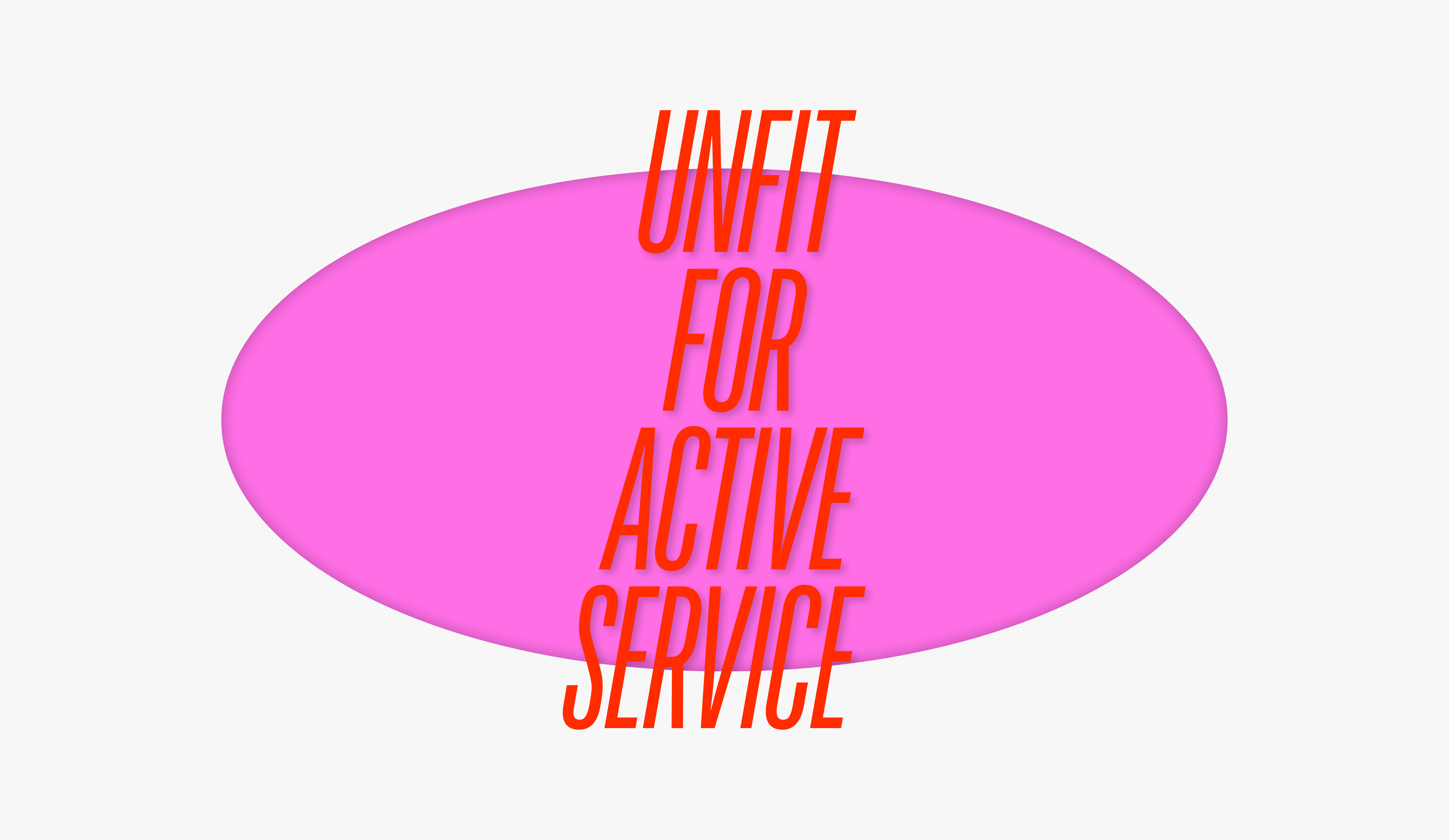
For the exhibition typography, we chose the look of comic books from the 1960s combined with extravagant advertising typography. Both are often seen in European Pop Art works.
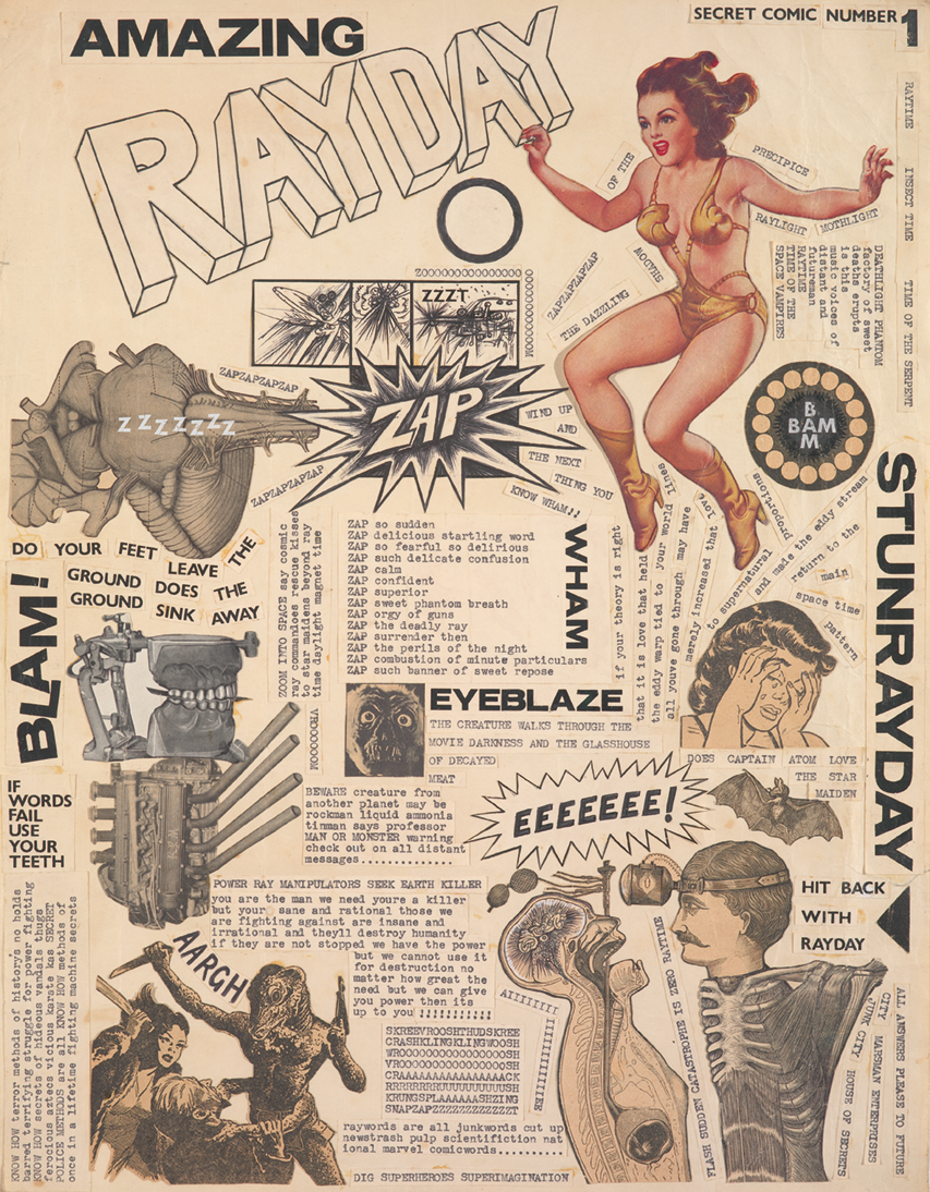
Jeff
Keen, Secret Comic 1, 1957


Client Museum MORE
On show February ‘25 — May ‘25
Exhibition design (spatial) Lies Willers
Graphic design Studio Mayra & Sam
Production Planemos, Riwi Collotype
Credits photography Eva Broekema
On show February ‘25 — May ‘25
Exhibition design (spatial) Lies Willers
Graphic design Studio Mayra & Sam
Production Planemos, Riwi Collotype
Credits photography Eva Broekema